ROLE
UX/UI Design
TIME
November 2020 - 4 Hours
PROJECT STATUS
My work was well received by my interviewers and I was offered an internship with IBM. I accepted the offer and had the opportunity to intern with the IBM Z team from May 2021 - May 2022.
OVERVIEW
This design challenge was a part of my application process to IBM’s UX Design internship for Summer 2021. I was told to redesign the Hertz mobile app so it was better suited for a mid-career professional. As my primary discipline was UX design, this project focused on my abilities to address user needs, translate user insights into improved interactions, and understand information architectures.
"Design a better way for a mid-career professional who occasionally travels for work to find just the right vehicle"
User Research
Research Insights (provided by prompt)
This particular user type values having lots of information and control over the kind of car they ultimately choose to reserve.
1.
There is frequent and pervasive evidence of sentiment from all user types around the theme of, “I just want to browse and understand my options.”
2.
Existing App Analysis
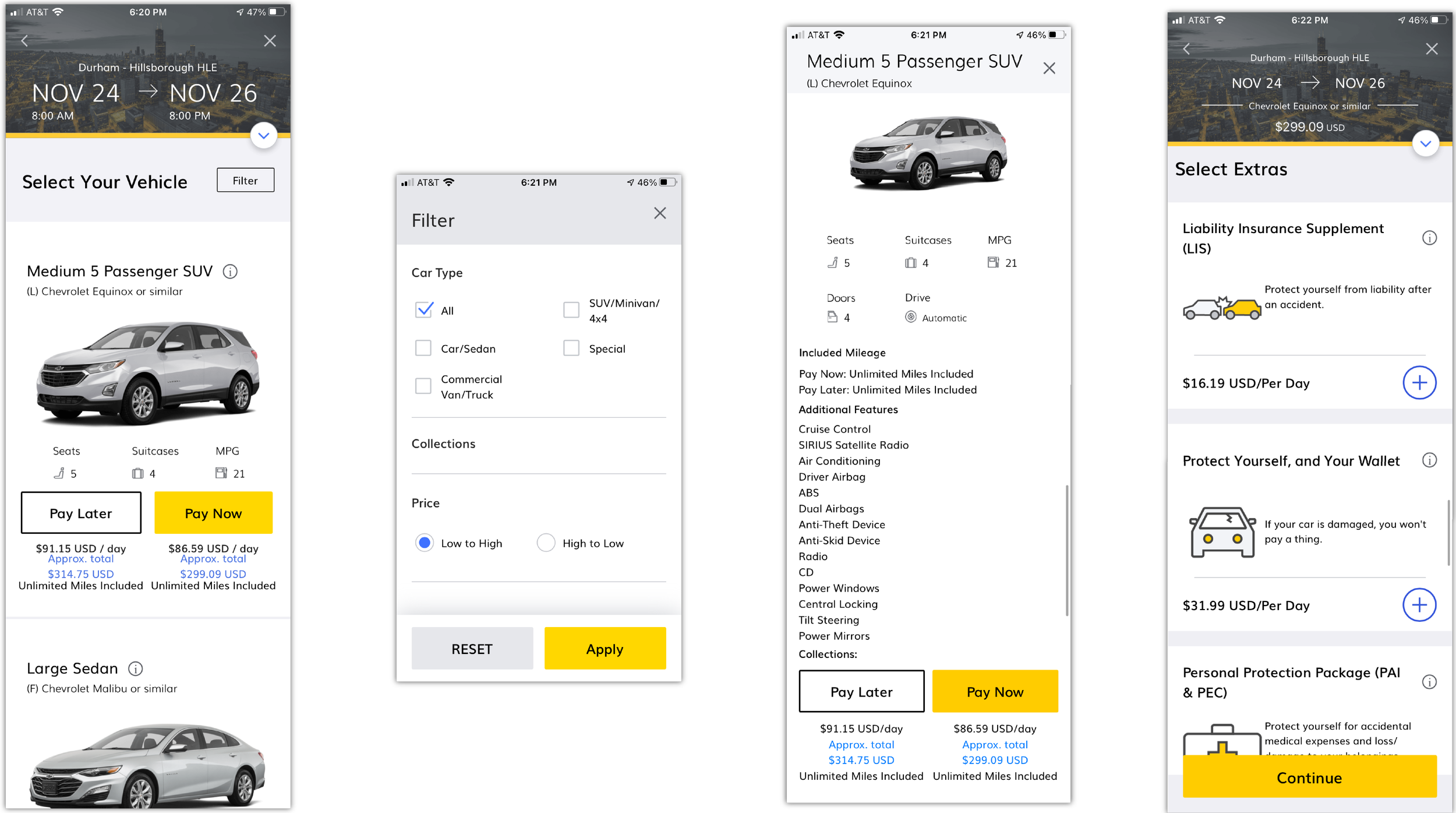
Ideally, I would have chosen to perform a usability test with 3-5 users to observe and better understand the user’s thoughts as they navigated through the app. Instead, I attempted to put myself in the users shoes and evaluate the interface.
View vehicle
→
Apply filter (optional)
→
Select vehicle
→
Add extras
→
Check out
Pain Points
Based on my findings from the app exploration I was able to identify numerous pain points that directly conflicted with the prompt given:
Unable to compare vehicles since each one took up entire screen space → Users are not able to effectively understand all options
1.
Additional features information architecture was overwhelming → Users may have a hard time understanding their options
2.
Additional features button was difficult to see → Users may not feel they have all the information
3.
Pay button was not clearly differentiated → Users may be confused about their options
4.
Filter was limited → Users may feel they have little control
5.
Competitive Analysis
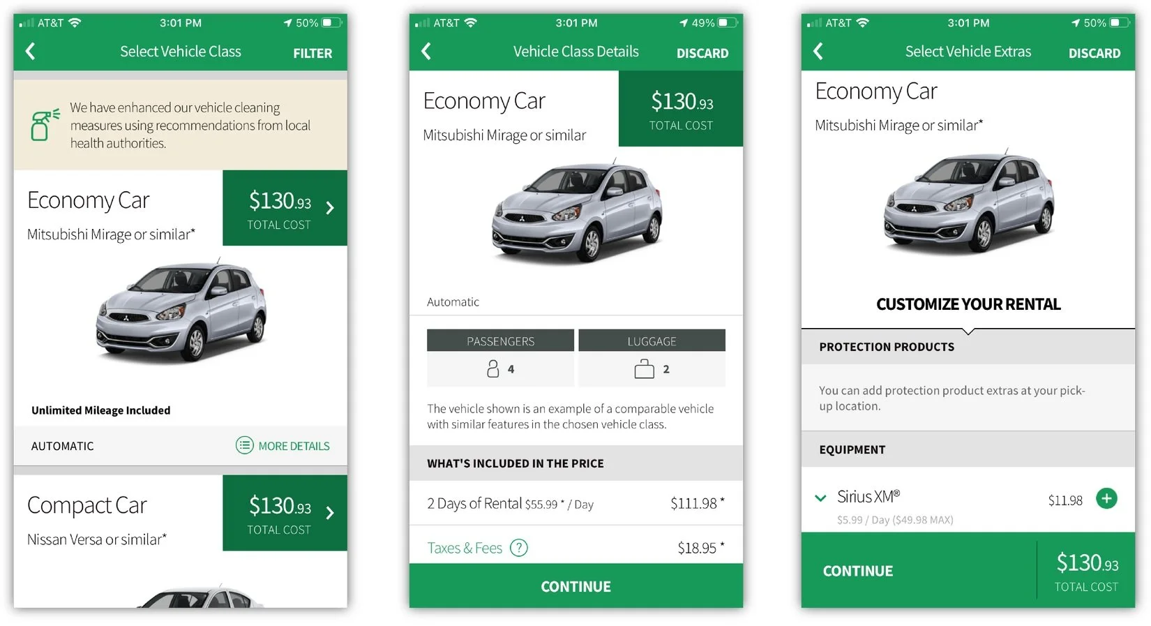
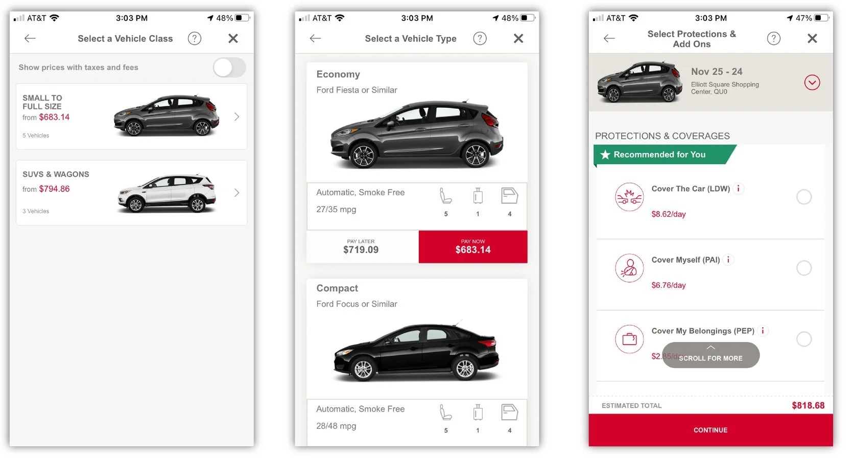
I chose to evaluate three highly rated car rental apps to gain some inspiration for the redesign, identify areas of improvement for Hertz, and also see what to avoid.
✅ Price is easy to see
✅ “More details” CTA is descriptive
✅ Vehicle image/model is still visible after selecting vehicle
❌ Large images makes it difficult to compare vehicles
✅ Small images make it easier to compare vehicles
✅ Vehicle image/model is still visible after selecting vehicle
❌ Not clear where to click for more info
✅ Small images make it easier to compare vehicles
✅ Dropdown lifts prevents users from having to flip through screens
✅ Progress bar lets users know where they are in the process of the user journey
❌ “Add extras’ page seems overwhelming and confusing
Design
Now that I had a sense of how the app should flow and be designed, it was time to start brainstorming and finding ways to turn some pain points into design opportunities.
Brainstorming
Users should be able to compare multiple cars
1.
Increase filter option
2.
Improving the additional features layout
3.
User should always be aware of what they are purchasing (cost, model, extras)
4.
Wireframes
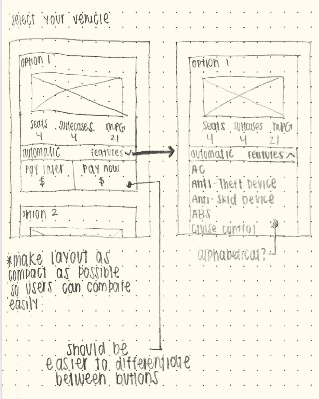
I began visualizing my design by sketching out the wireframes. In the first screen sketch, I chose to make the description as compact as possible. This is so that user will have the ability to compare vehicles since each vehicle will not take up the whole screen. Additionally, I made a note to provide a clearer distinction between pay later and pay now buttons. Finally, I made each card expandable. Similar to the National app layout, I created a collapsible list of the additional features to prevent users from having to flip between pages.
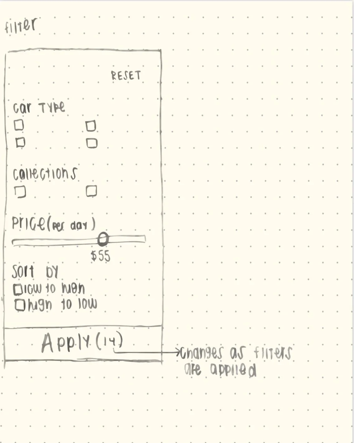
In the sketch of the filters, I kept everything the same but I added a price range feature to increase the control users have and I listed a number beside “apply” to indicate how many cars fit the filters selected. This will prevent users from switching back and forth the filter and the selection of cars in case they set too many or too little filters.
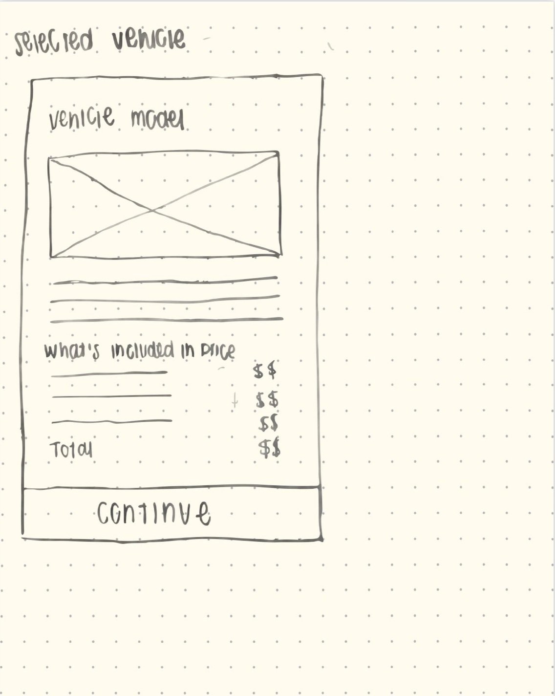
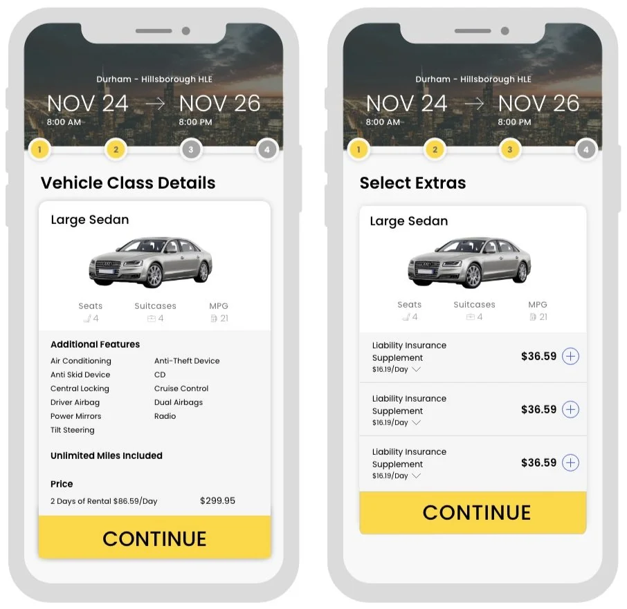
In the next sketch, I chose add a new task to the task flow. I add a new page that would provide a description of the car chosen before selecting extras to add. I hypothesize that this screen will give users a greater sense of control because they will be shown exactly what has been selected and a clear description of the car as well as the price before they proceeded to add extras to their vehicle.
The final screen is similar to the original add extras page, but I added a image because as mentioned earlier this is helpful to users who are unfamiliar with car models. I also incorporated the collapsible feature for each extra. This again will prevent users from flipping back and forth and will give all the information needed in one place.
Solution
Key Enhancements
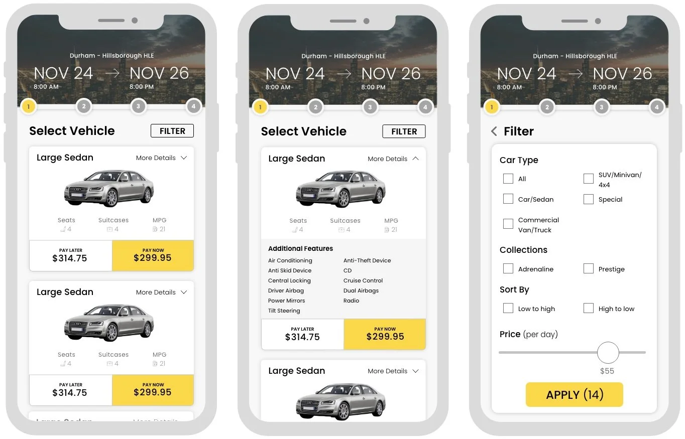
I included a progress bar at the top to give users a better sense of control. This will indicate exactly where they are in their journey and they will not the wondering how many step are left. As mentioned in the sketches, I created a more compact description of the vehicle by decreasing the size of the image. I also created a greater distinction between the pay now and pay later buttons by increasing the size of the price so users can see what makes them different. A change that I made from the sketch was that I moved the ”more details” button to the top of the card. I did this because as I was designing the screen, I noticed the button had a small touch target so I wanted to ensure that when users go to tap this button they would not accidently tap something else like the pay now button.
In the second screen I provided a visual of how the expanded card would look. I also organized the features alphabetically so that if users were to to search for a specific feature they would be able to quickly find it rather than having to search through the whole list.
As mentioned in the sketches, I added an extra page. This page shows a confirmation of the car selected before users head to the add extras pages. This basically ensures that users know exactly what they selected and they have all that information in one place.
The final page is exactly as the sketch where users can just tap to add a feature and the expandable description allows for them to have all the information in one page.
Reflection
If this had been a longer project I would have taken some additional steps to ensure I was creating an ideal flow and experience for the user. However, since my time was extremely limited I had to expedite some of the steps in the process. If I was given the opportunity to continue working on this project this is how I would go forth:
Research
Better understand the user’s thoughts through user journey mapping
1.
Conduct usability tests to validate assumptions and iterate my design
2.
Validate my designs with A/B testing
3.
Next Steps
Increasing the amount of filters
1.
